Sometimes that frustration is caused by dull coding: the kind of code you've done a dozen of times before in slightly different configurations. Creating getters and setters, adding listeners to buttons, blah blah blah.
Then again other times, it's simply a lack of knowledge and perhaps communication with the users on how to do things better.
In other words, UI design (often) both sucks for us programmers, who have to make it and do not like it, and for the users, who have to use the half-assed programs created by demotivated programmers.

Programmers aren't necessarily designers, after all, right?
So how can you make your life a bit easier as a programmer? I've summarized the following tips which I have collected via trial and error and pinches of design experience:
- Group together what from a user's view logically belongs together.
- Visually separate actions that are functionally different: don't place a delete button right next to an add button.

The box on the right would make multiple problems. One is: what happens if the user clicked on the remove button instead of add? - Critical actions, like removing data or changing a large set of data, need a higher use-threshold e.g. via a dialog: "Are you sure to do that...?". Those are the kind of actions you don't want to happen if you click on them by accident.
- Important actions should be highlighted through movement, form, shape and color. Like this you can control the flow of your user's attention - and where they are likely to click next.
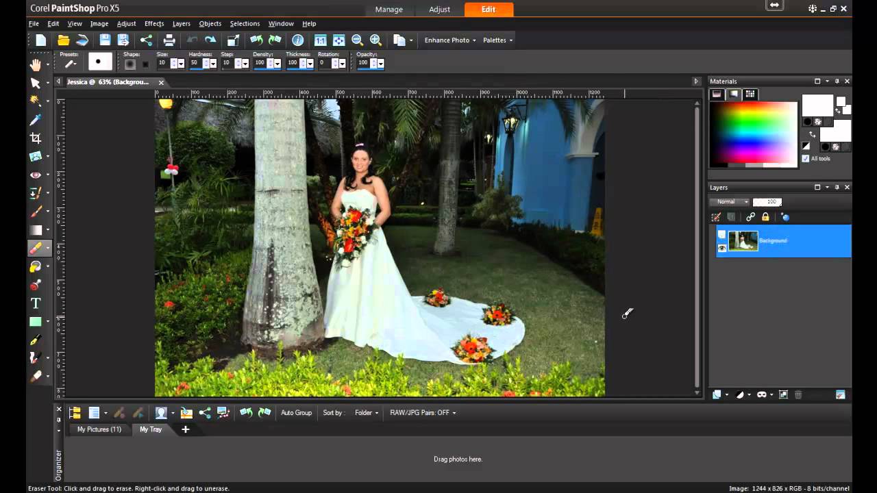
- Meaningful usage of icons can increase the intuitiveness of your software - but don't overdo it. PaintShop Pro is basically bloated with them and here they are more confusing than helping.
- The look and design of your components should be aesthetically coherent. Think of it like this: In code, you set the rules for your code, how it looks like via style guides and so on. This is in fact very similar to interface design: you can also set a visual rules here and apply them your components: e.g. all interactive components like buttons, menus should be blue, background stays white.
Read: How to chose a proper color scheme for your interface? - Do not overload your interface with components or buttons. Instead, make information toggleable from display and use meaningful sub-menus, while keeping those sub-menus as accessible as possible, e.g. via shortcuts. Ideally, a single sub-menu should be like a red-black tree with a maximum depth of 3 to 4.

Menus like this often don't have a depth more than two or three. - The more a user uses a function, button or component in a program, the more accessible it should be. This helps the user's workflow and makes your software easier to use.
- Give users the possibility to customize views so they can adapt the software to their special needs and workflow.
- Support the users by assistants, in-app hints or tooltip texts.


I hope you found these tips helpful. You are more welcome to add more suggestions in the comments!
Thanks for reading!
Keine Kommentare:
Kommentar veröffentlichen
Hinweis: Nur ein Mitglied dieses Blogs kann Kommentare posten.